UpsellBlock
The UpsellBlock is a slider banner that displays a list of products added during its creation, presenting them in a convenient slider format. Optionally, a block with custom content can be added at the beginning of the slider, allowing for various configurations, such as setting a background, and adding images, buttons, text, and titles.
Structure examples
Take a look at an example, to further understand the possibilities of an UpsellBlock.
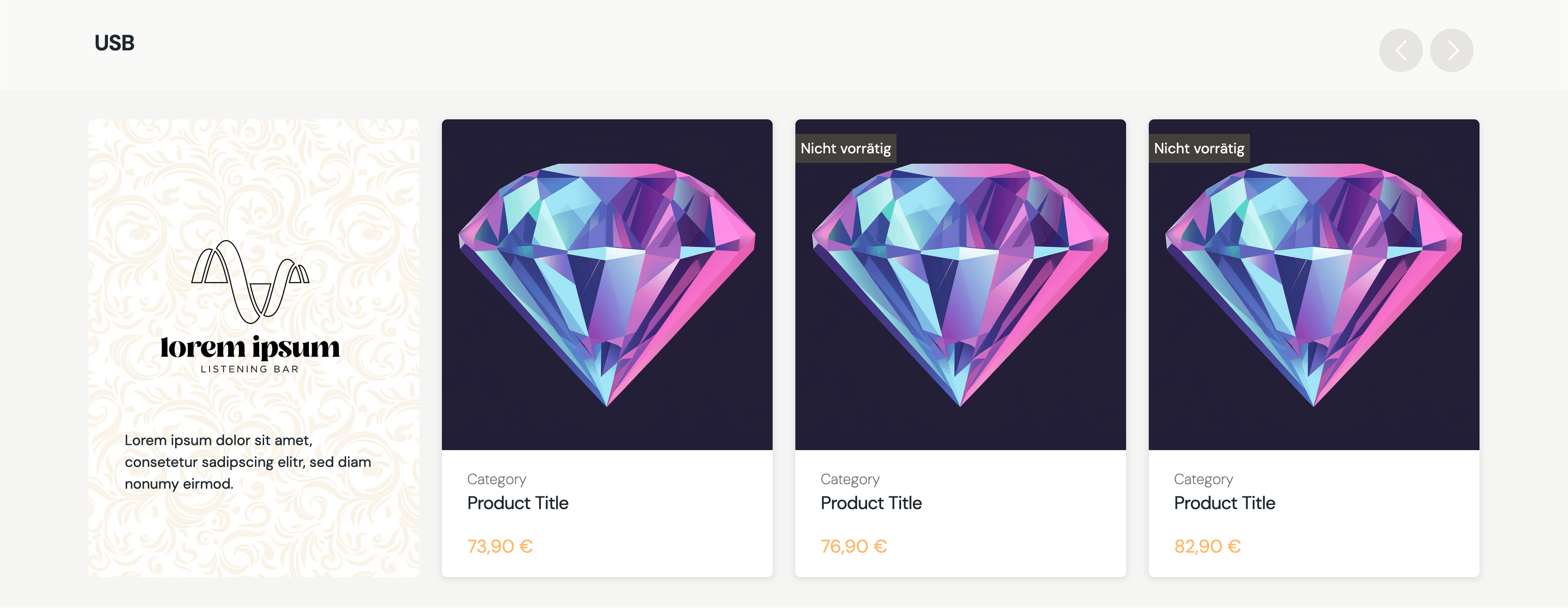
The slider can always be interacted with by using touch interaction. Furthermore, are navigation buttons visible on screens that are larget than 950px.
Create
POST _apiBaseUrl/v1/cms/banner/upsell-blockThe UpsellBlock can be split up into two parts: The Slider items and the Funnelbock. Those two are the two actors of that banner. Let's break down each part seperately.
Slider items
The sliderItems attribute is resposible for the items shown in the slider. Each array item is a loosely connected product.
The data for the product itself is then fetched on-demand, when the banner itself is fetched by the frontend.
If the banner fails to fetch a product for the slider, it's simply skipped and not added to the final slider object.
"sliderItems":[
      {
         "__typename":"Product",
         "gid":"gid://shopify/Product/1234567890"
      },
      {
         "__typename":"Product",
         "gid":"gid://shopify/Product/1234567890"
      },
      {
         "__typename":"Product",
         "gid":"gid://shopify/Product/1234567890"
      }
   ],
Funnel block
Although the funnel block is optional, when added it comes with various options.
The funnelBlock allows any nestable banner to be added to the content payload of it. This is done via by loosely connecting other banners to the funnel.
This is followed by the background option. If a background is set, it will stretch across the whole container of the funnel block, so keep that in mind when adding a background. If no background is provided, the funnel block will have a neutral white background.
The last thing are some style options that can be applied to the funnel, including aligment of the content and a max height for the container. The max height is useful to prevent the whole slider and its items to grow to big. Instead if the funnel gets above the max height, it will cut off everything past that and become scrollable.
{
    "funnelBlock":{
       "banners":[
          {
             "__typename":"ImageBlock",
             "id":"my-image-id"
          },
          {
             "__typename":"TextBlock",
             "id":"my-text-id"
          }
       ],
       "background":{
          "url":"https://my-image-url.png",
          "altText":"background"
       },
       "styleOptions":{
          "widthEqualsSlidesAmount":2,
          "alignmentY":"center"
       }
    }
}
The upsell block itself
The third part is the upsell block itself. Allowing to add a title above the slider, setting a global background for the block background and some style options to further configure the banner.
{
   "displayTitle":{
      "content":"USB",
      "size":"xl2",
      "weight":"semibold",
      "classification":"sans"
   },
   "sliderItems":[...],
   "background":null,
   "funnelBlock":{...},
   "styleOptions":{
      "sort":"price"
   }
}
Code
CreateUpsellBlockDto{
"displayTitle":{
"content":"USB",
"size":"xl2",
"weight":"semibold",
"classification":"sans"
},
"sliderItems":[
{
"__typename":"Product",
"gid":"gid://shopify/Product/1234567890"
},
{
"__typename":"Product",
"gid":"gid://shopify/Product/1234567890"
},
{
"__typename":"Product",
"gid":"gid://shopify/Product/1234567890"
}
],
"background":null,
"funnelBlock":{
"banners":[
{
"__typename":"ImageBlock",
"id":"my-image-id"
},
{
"__typename":"TextBlock",
"id":"my-text-block-id"
}
],
"background":{
"url":"https://my-image-url.png",
"altText":"background"
},
"styleOptions":{
"maxHeight":"360px",
"alignmentY":"center"
}
},
"styleOptions":{
"sort":"price"
}
}Arguments
An optional title, that sits above the upsell block itself.
A list of all products that should be added to the slider.
An optional background, that stretches across the whole background of the upsell block.
The optional funnel block that can be added at the start of the slider as slider items.
An array of loosely connected nestable banners, which are rendered inside the funnel block.
An optional background image that only stretches across the funnel block.
Optional style options to further configure the funnel block itself.
Sets the width of the funnel block. The width is calculated based on the given number multiplied by the width of one slider item. So 2 would equal the width of two slider items. The max-width of the container is calculated to always fit into the screen complety. So on especially small screen devices, will the funnel block fit into the view as well and stretch back to the given width, when the screen size expands.
An optional value to determines the alignment of the content inside the funnel block on the y-axis.
Optional style options to further configure the upsell block.
Enable or disable the buttons on the top right of the slider to navigate the slider with buttons.
An optional value to define how the products in the slider should be sorted. For example could the products be sorted by their price.
An optional value to define how the products in the slider should be sorted. Either ascending or descending.