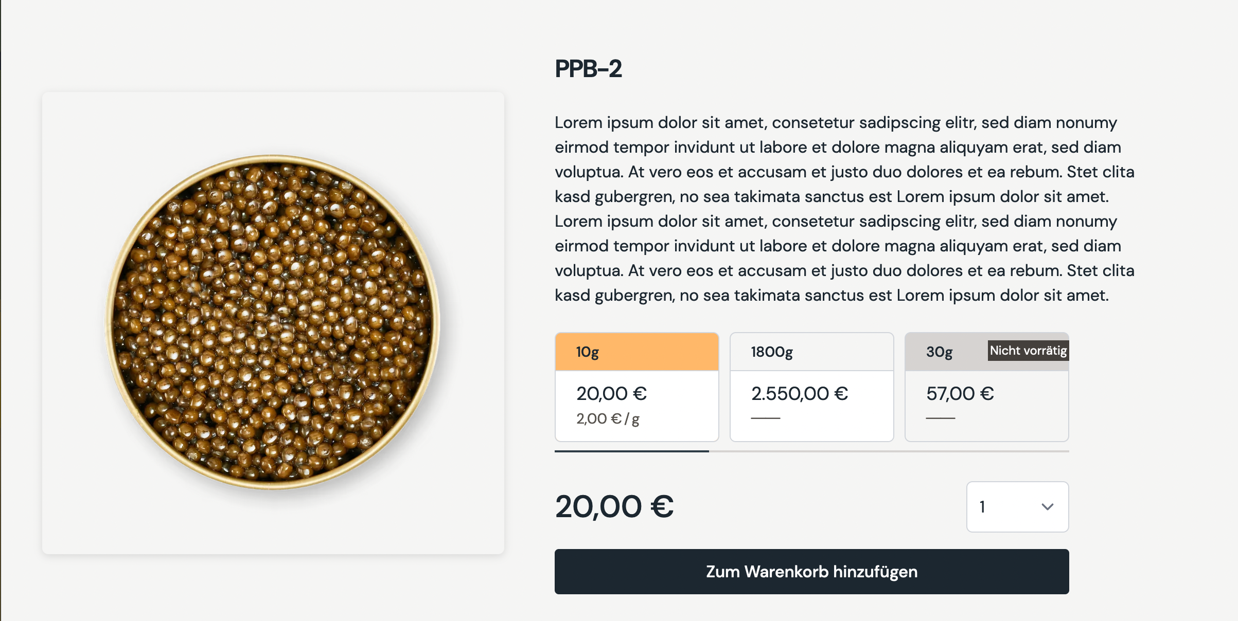
ProductPreviewBlock
The ProductPreviewBlock is basically a minified version of a dedicated product page, directly embedable into any page as banner. The banner itself includes:
- A slideshow of all product images
- The product title
- The product description
- Variants of the product for selection (optional)
- The product price
- An amount selector (optional)
- An add to cart button
Structure examples
Take a look at the default example, to further understand the configuration options for a ProductPreviewBlock.
If the featured product in the slider has several images, the static image preview turns into a slider. The slider can always be navigated by touch interactions. Additionally are navigations button visible on screens that are larger than 1280px.
The same goes for the slider of the variants of the product. Touch interaction is always enabled, but buttons are only visible on screen larger than 1280px.
Create
POST _apiBaseUrl/v1/cms/banner/product-preview-blockCode
ProductPreviewBlockDto{
"requiredDisplayTitle":{
"content":"PPB-2",
"size":"xl2",
"weight":"semibold",
"classification":"sans"
},
"displayDescription":{
"content":"Lorem ipsum dolor sit amet, consetetur sadipscing elitr, ...",
"size":"base",
"weight":"normal",
"classification":"sans"
},
"product":{
"__typename":"Product",
"gid":"gid://shopify/Product/134567890"
},
"styleOptions":{
"showQuantitySelector":true
}
}Arguments
The title displayed at the top of the banner, right above the description.
An optional description.
Object to determine the correct product reference, that will be used in the banner to fetch its images, variants and prices.
Optional style options to customize the product preview block.
Determines if the product quantity selector should be rendered on the banner or not.